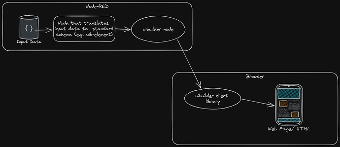
Now that v6.1 is published with its new uib-element and uib-update nodes. I'd like to keep a running update of what elements have been built, what enhancements might be needed and the ones I'd like to build.
As such, I'd also really appreciate feedback on what elements you'd like worked on. Note that I don't intend to squeeze absolutely everything into the uib-element node. I do want to make it easy for other people to create nodes. Actually, you could do that right now simply by looking at the source for the uib-element node since the output data schema is published.
Already completed
List (ul, ol, dl)
Future improvements:
- Better validation of input data
- list-style-type (add to outer) - several options plus text (incl emoji's)
- ? Optional list leading/trailing text ?
Table
Future improvements:
- Additional field definitions in input data
- Better validation of input data
- Caption
- If named row comes from a field, make sure it is the 1st col and marked as a th
- Add data-row-name to td's as well
HTML
Allows raw html to be sent - e.g. from a core template node. Note that if the DOMPurify library is loaded, input is filtered for safety.
Page Title
Updates the page's title (in the head section) and updates/adds an H1 heading.
Table Row
Adds a row to an existing table.
List Item
Adds a row to an existing ul/ol list.
Future improvements:
- Better validation of input data
- list-style-type (add to outer) - several options plus text (incl emoji's)
- Add Description list entry rows
Card/Article
Future improvements:
- Better layout, more optional internal structure (footer, etc)
Simple Form
With input types: button, checkbox, color, date, detetime-local, email, hidden, month, number, password, radio, range, tel, text, time, url, and week.
Future Improvements:
- Better validation of input data
- Additional input types: select, combo, file, image, textarea.
- Eventually add extended inputs such as HTML WYSIWYG/Markdown
- Add Auto-complete for text inputs
- If no button added, make each input send changes direct - or possibly add that as an optional setting.
Planned
-
Status Box, Status Panel - ref
A segmented vertical/horizontal status/progress panel. For things like battery displays, etc.
Each status box has a coloured sidepanel to show the status. -
Toggle button, Toggle button panel
Similar to the status box/panel but for buttons. -
Grid/Flex-Grid
Standardised layout. With option to turn on visible grid to help with layout. -
Markdown
Allow raw Markdown to be sent similar to the HTML element. Will require the Markdown-IT library to be loaded as per other uibuilder Markdown support. -
Individual Form Elements
This is to enable additional form elements to be added to an existing form.- Select - Editable Combobox With Both List and Inline Autocomplete Example | APG | WAI | W3C
- Input
- button (NB: add type="button" to avoid form submit issues, click=uibuilder.eventSend by default)
-
tbody
Additional table body sections. ref -
iFrame
As for ui-iframe -
notify (globalNotification)
-
Modal Dialogue
-
LED (on/off/colour/brightness), LED panel
As for ui-led -
Status timeline
Maybe uPlot with timeline plugin? ref -
Image.
Allowing for buffer->data-uri->img-tag, data-uri->img-tag, URL->img-tag. ref -
Container
Standard layout. With option for drag/drop of contents. ref -
Style/Theme changer.
Extended version of the one in my experimental W3C Components repo. Will let you change between light/dark mode, change base colours, etc. Example component
So please do suggest others or offer suggestions for enhancements.


