Well I just don't want to be remembered as the man who turned every bit and byte to gauges... 
Oops, might be a bit late for that!
But then they are absolutely on-topic for everyone using Node-RED for IoT and more. Can't beat a good gauge.

My phone beeped and the news is that Gauge is not far away anymore.
Still, I did some cleanup and improvements for my creations,
 It is now 3 of them merged all in one template. Configure look and feel.
It can be adjusted too look nice on light or dark background
Gauges do resize. 1x1 for round gauge is a bit too small. 2x1 container is optimal.
Configuration is easy and every bit is commented - read carefully.
Feel free to use, adjust or change and make it look and feel it as you wish.

TEMPLATE:
<template>
    <template v-if="type === 'round'">
        <div ref="hng" class="round-led-level" :style="`--size:${size}; --shadow:${shadow}; --ledsize:${ledSize};`">
            <header>
                <div class="round-led-level-text">
                    <span class="round-led-level-label">{{label}}</span>
                </div>
            </header>
            <div>
                <div class="round-led-level-stripe">
                    <div v-for="(color, index) in colors" :key="index" class="round-led-level-led"
                        :ref="'dot-' + index"></div>
                </div>
                <div class="round-led-level-centered-text">
                    <span class="round-led-level-value">{{formattedValue}}</span>
                    <span class="round-led-level-unit">{{unit}}</span>
                </div>
                <div class="round-led-level-limits">
                    <span>{{min}}</span>
                    <span>{{max}}</span>
                </div>
            </div>
            <div>
    </template>
    <template v-if="type === 'linear'">
        <div ref="hng" class="led-level" :style="`--shadow:${shadow};`">
            <div class="led-level-text">
                <span class="led-level-label">{{label}}</span>
                <span class="led-level-value">{{formattedValue}}<span class="led-level-unit">{{unit}}</span></span>
            </div>
            <div class="led-level-stripe">
                <div v-for="(color, index) in colors" :key="index" class="led-level-led" :ref="'dot-' + index"></div>
            </div>
            <div class="led-level-limits">
                <span>{{min}}</span>
                <span>{{max}}</span>
            </div>
            <div>
    </template>
    <template v-if="type === 'artless'">
        <div ref="hng" :class="icon ? 'ag-wrapper-2' : 'ag-wrapper-1'" :style="`--line-color:${colors[0]};`">
            <div v-if="icon" class="ag-icon">
                <v-icon aria-hidden="false">{{icon}}</v-icon>
            </div>
            <div class="ag-content">
                <div class="ag-text">
                    <span class="ag-label">{{label}}</span>
                    <span class="ag-value">{{formattedValue}}<span class="ag-unit">{{unit}}</span></span>
                </div>
                <div class="ag-track" ref="agLine">
                    <div class="ag-track-background"></div>
                    <div class="ag-track-foreground" :style="{'width': percentage +'%'}"></div>
                </div>
                <div class="ag-limits">
                    <span class="ag-min">{{min}}</span>
                    <span class="ag-max">{{max}}</span>
                </div>
            </div>
        </div>
    </template>
</template>


<script>
    export default {
    data(){
        return {
            //Define me here
            type:"round", // Gauge type. "artless", "linear" or "round"
            label:"Round Gauge", // The label
            icon:"mdi-account", // (type: artless) (optional) the icon
            min:0, // Smallest expected value
            max:100, // Highest expected value
            unit:"cm³",// The unit of the measurement
            dim:0.3, //(type: round, linear) How dim is led when not glowing
            shadow:0.5, //(type: round, linear) Led shadow intensity (too much makes graphics muddy)
            filterFunction:"brightness", // (type: round, linear) "brightness" for dark themes, "opacity" for light themes
            animate:true, // Animating led's is not most performant thing in the world.

            // Define colors

            // For type "round" and "linear" the count of colors equals count of led's.
            // For type "artless" first color from colors array is used.
            // For type "round" the led size depends on how many colors is defined. About 20 is optimal.
            // Color can be defined as:
            // HEX - "#FF00FF"
            // RGB - rgb(0,65,88)
            // named color - "red"
            // or depend on some defined CSS variable
            colors:[
                    "rgb(var(--v-theme-success))",
                    "rgb(var(--v-theme-success))",
                    "rgb(var(--v-theme-success))",
                    "rgb(var(--v-theme-success))",
                    "rgb(var(--v-theme-success))",
                    "rgb(var(--v-theme-success))",
                    "rgb(var(--v-theme-success))",
                    "rgb(var(--v-theme-success))",
                    "rgb(var(--v-theme-success))",
                    "rgb(var(--v-theme-success))",
                    "rgb(var(--v-theme-success))",
                    "rgb(var(--v-theme-success))",
                    "rgb(var(--v-theme-success))",
                    "rgb(var(--v-theme-warning))",
                    "rgb(var(--v-theme-warning))",
                    "rgb(var(--v-theme-warning))",
                    "rgb(var(--v-theme-error))",
                    "rgb(var(--v-theme-error))",
                   ],

            //no need to change those
            value:0,
            previousValue:0,
            size:100,
            inited:false
        }
    },


    methods: {
        getElement: function(name,base){
            if(base){
                return this.$refs[name]
            }
            return this.$refs[name][0]
        },
        validate(data){
            let ret
            if(typeof data !== "number"){
                ret = parseFloat(data)
                if(isNaN(ret)){
                    console.log("BAD DATA! gauge type:",this.type, "id:",this.id,"data:",data)
                    return null
                }
            }
            else{
                ret = data
            }

            return ret
        },

        full: function(){
            return Math.floor(this.colors.length*this.percentage/100)
        },
        half: function (){
            let p = this.colors.length*this.percentage/100;
            p -= this.full()
            p *= .5
            p += this.dim;
            return p;
        },
        filter: function(amount){
            let f
            switch(amount){
                case "full":{
                    f = this.filterFunction == "brightness" ? "brightness(1.1)" : "opacity(1)";
                    break
                }
                case "half":{
                    f = this.filterFunction == "brightness" ? "brightness(" +this.half()+")" : "opacity(" +this.half()+")";
                    break
                }
                default:{
                    f = this.filterFunction == "brightness" ? "brightness(" +this.dim+")" : "opacity(" +this.dim+")";
                    break
                }
            }
            return f
        },

        lit: function(){
            if(this.inited == false){
                return
            }
            const down = this.previousValue > this.value

            let time = .01
            this.colors.forEach((e,i) => {
                let dot = this.getElement("dot-"+i);
                if(!dot){
                    console.log("lit() no dots found")
                    return
                }
                if(i<this.full()){
                    dot.style.filter=this.filter("full");
                    dot.style.outlineColor="#ffffff40" ;
                }
                else if(i==this.full()){
                    dot.style.filter= this.filter("half");
                    dot.style.outlineColor="#ffffff40" ;
                }
                else{
                    dot.style.filter= this.filter("dim");
                    dot.style.outlineColor="#00000040" ;
                }
                if(down){
                    time = (this.colors.length - i) * .12
                }
                dot.style.transition = this.animate ? "filter "+time+"s" : "unset";
            })
            this.previousValue = this.value
        },
        onResize:function(){
            let g = this.getElement("hng",true)
            if(!g){
                return
            }
            this.$nextTick(() => {
                this.size = g.clientWidth;
                this.updateLayout()
            })
           g.style.setProperty('--size',this.size);
        },
        updateLayout:function(){
            let angle;
            const step = 270 / this.colors.length;
            const radius = (this.size - (this.size*0.1))/2
            const s = this.ledSize / -2;
            this.colors.forEach((c,i) => {
                    let dot = this.getElement("dot-"+i);
                    if(!dot){
                        console.log("round init()  no dots found")
                        return
                    }
                    dot.style.backgroundColor = c
                    dot.style.transition = "filter 0.1s";
                    dot.style.setProperty('--dot',i);
                    angle = ((i+1)*step) * Math.PI / 180;
                    dot.style.left = s + radius * Math.cos(angle) + 'px';
                    dot.style.top = s + radius * Math.sin(angle) + 'px';
                    dot.style.transform = 'translate('+s+'px, '+s+'px)';
                    dot.style.rotate = (angle - 0.08)+"rad"
                }
            )
        }
    },
    watch: {
        msg: function(){
            if(this.msg.payload != undefined){
                const v = this.validate(this.msg.payload)
                if(!v){
                    return
                }
                this.value = v
                if(this.type != "artless"){
                    this.lit()
                }
            }
        }
    },
    computed: {
        formattedValue: function () {
            return this.value.toFixed(2)
        },
        percentage: function(){
            return Math.floor(((this.value - this.min) / (this.max - this.min)) * 100);
        },
        ledSize:function(){
            const s = 4.71239 * ((this.size - (this.size*0.3))/2)
            return s / this.colors.length
        }
    },
    mounted(){
        if(this.type == "round"){
            let g = this.getElement("hng",true)
            if(!g){
                return
            }
            this.resizeObserver = new ResizeObserver((entries) => {
                this.onResize()
            });
            this.resizeObserver.observe(g);

            setTimeout(()=>{
                this.onResize()
            },20)
        }
        else if(this.type == "linear"){
            this.colors.forEach((c,i) => {
                    let dot = this.getElement("dot-"+i);
                    if(!dot){
                        console.log("linear init() no dots found")
                        return
                    }
                    dot.style.backgroundColor = c
                    dot.style.transition = "filter 0.1s";
                }
            )
        }
        else{
            const line = this.getElement("agLine",true);
            line.style.setProperty('--line-color',this.colors[0])
            if(this.animate == true){
                if(!line){
                    console.log("artless init() no line found")
                    return
                }
                line.style.transition = "width 0.5s";
            }
        }

        this.inited = true;
    },
    unmounted () {
        if(this.resizeObserver){
            this.resizeObserver.disconnect();
            this.resizeObserver = null;
        }
    },
}
</script>
CSS:
.led-level{
    display: grid;
    grid-template-rows: 1.3em 1fr .7em;
    gap: 2px;
}
.led-level-stripe{
    display: flex;
    gap:2px;
}
.led-level-led {
    --s:var(--shadow,0.2);
    --shadowColor:rgba(0,0,0,var(--s));
    background: #ffffff;
    width: 100%;
    height: 100%;
    border-radius: 4px;
    box-shadow: inset 0px 0px 10px 0px var(--shadowColor), 0px 0px 3px 0px var(--shadowColor);
    filter: brightness(0.4);
}
.led-level-text{
    font-size: 1.25em;
    line-height: 1em;
    align-self: end;
    display: flex;
    flex-wrap: wrap;
    justify-content: space-between;
    user-select: none;
}
.led-level-value{
    font-weight:bold;
}
.led-level-unit{
    font-size:.75em;
    font-weight:normal;
    padding-inline-start: 0.15em;
}
.led-level-limits{
    display: flex;
    justify-content: space-between;
    font-size: .75em;
    line-height: .75em;
    align-content: flex-end;
    flex-wrap: wrap;
     user-select: none;
}
.round-led-level{
    display: grid;
    grid-template-rows: 1em 1fr;
    width:100%;
    height: 100%;
    aspect-ratio: 1/1;
    position: relative;
    margin: auto;
}
.round-led-level>div{
    position: relative;;
}
.round-led-level-stripe{
    display: block;
    position: absolute;
    left: 50%;
    top: 56%;
    rotate: 135deg;
}
.round-led-level-led {
    --s:var(--shadow,0.2);
    --shadowColor:rgba(0,0,0,var(--s));
    background: #ffffff;
    position: absolute;
    width: calc(var(--ledsize) * 1px);
    aspect-ratio: 1/1;
    border-radius: 4px;
    box-shadow: inset 0px 0px calc(var(--ledsize) / 3 * 1px) 0px var(--shadowColor), 0px 0px calc(var(--ledsize) / 7 * 1px) 0px var(--shadowColor);
    filter: brightness(0.4);
    transform-origin: center center;
}
.round-led-level-text{
    font-size: clamp(0.5em,calc(var(--size) * .1 * 1px),1.25em);
    line-height: 1rem;
    text-align: center;
    user-select: none;
    white-space: nowrap;
}
.round-led-level-centered-text{
    position: absolute;
    inset: 0;
    font-size: 1rem;
    line-height: 1;
    display: grid;
    text-align: center;
    grid-template-rows: 1.5fr 1fr;
    gap: 0.1em;
    user-select: none;
    align-items: center;
}
.round-led-level-value{
    font-weight:bold;
    font-size: calc(var(--size) * .15 * 1px);
    align-self: end;
}
.round-led-level-unit{
    font-size:calc(var(--size) * .1 * 1px);
    font-weight:normal;
    align-self: start;
    padding-inline-start: 0.15em;
}
.round-led-level-limits{
    position: absolute;
    inset:0;
    display: flex;
    justify-content: space-between;
    font-size: calc(var(--size) * .06 * 1px);
    line-height: calc(var(--size) * .06 * 1px);
    align-content: flex-end;
    flex-wrap: wrap;
    padding-inline:1em;
    user-select: none;
}
.ag-wrapper-2 {
    display: grid;
    grid-template-columns: 3em 1fr;
    gap:1em;
}
.ag-wrapper-1 {
    display: grid;
    grid-template-columns: 1fr;
}
.ag-icon{
    font-size: 2em;
    display: flex;
    flex-direction: column;
    justify-content: center;
}
.ag-content{
    display: grid;
    grid-template-rows: 1fr 7px 0.75em;
    gap: 2px;
}
.ag-text{
    font-size: 1.25em;
    line-height: 1em;
    align-self: end;
    display: flex;
    flex-wrap: wrap;
    justify-content: space-between;
    user-select: none;
}
.ag-value{
    font-weight:bold;
}
.ag-unit{
    font-size:.75em;
    font-weight:normal;
    padding-inline-start: 0.15em;
}
.ag-limits{
    display: flex;
    justify-content: space-between;
    font-size: .75em;
    line-height: .75em;
    align-content: center;
    flex-wrap: wrap;
    user-select: none;
}

.ag-track{
    position:relative;
    display:flex;
    align-items: center;
    width: 100%;
    border-radius: 6px;
}

.ag-track-background{
    position:absolute;
    background: var(--line-color,rgb(var(--v-theme-primary)));
    opacity: 0.45;
    width: 100%;
    height: 50%;
    border-radius:inherit;
}
.ag-track-foreground{
    position:absolute;
    background-color: var(--line-color,rgb(var(--v-theme-primary)));
    width: 50%;
    height: 100%;
    max-width: 100%;
    border-radius:inherit;
    transition:inherit;
}
Yep - new UI Gauge should go out today. It doesn't have the linear/compass options yet, and I don't have the segmented style so beautifully demonstrated by @hotNipi - but you can see a preview of it here: New Widget: UI Gauge by joepavitt · Pull Request #530 · FlowFuse/node-red-dashboard · GitHub and a breakdown of the examples (in the docs that are already live) here: Gauge ui-gauge | Node-RED Dashboard 2.0
Having this css for the page, can you help me make the title bar also transparent? @joepavitt @hotNipi

/* cuida do fundo */
.v-main {
    background-image: url('/fundo.jpg');
    background-size: cover;
}

/* cuida do grupo */
.nrdb-ui-group .v-card  {
    background-color: #00000040 !important; /* cuida da cor do fundo dos grupos do menu */
    border-radius: 10px !important; /* cuida da curva dos cantos do cartão de grupo */
    border: 1px solid #000000;
    color: #ffffff;

}

/* cuida do estilo de fonte a pagina */
body {
    font-family: monospace;
}

/* cuida do menu */
.v-navigation-drawer {
    background-color: #00000040;
}

/* cuida da cor do titulo do grupo */
.v-card-title {
    color: #ffffff;
}

/* cuida da cor do titulo do menu */
.v-list-item-title {
    color: #ffffff;
}
.v-app-bar.v-toolbar {
    background: transparent;
}

Use the browsers dev tools to find the path each and every item you wish to adjust.

As per @Steve-Mcl's note, if you're in Chrome for example, right click it > "Inspect Element", and it'll show the CSS classes applied to that element which you can use for a selector.
Thank you to everyone who is helping me, everything went well and I'm already moving forward with the project.
I'm counting on the help of insurance to get out of this:

<template>
    <div class="card_alexa">
        <div class="play_stop">
            <v-btn class="button_play" ref="button" stacked @click="play">
                <v-icon class="icon_cinema" ref="icon">mdi-play</v-icon>
            </v-btn>
            <v-btn class="button_stop" stacked @click="stop">
                <v-icon class="icon_cinema">mdi-stop</v-icon>
            </v-btn>
        </div>
        <v-slider class="slider_alexa"></v-slider>
        <v-text-field class="text_alexa"></v-text-field>
    </div>
</template>


<style>
    .card_alexa {
        display: flex;
        flex-direction: column;
        justify-content: center;
        align-items: center;
        height: 250px;
        width: 250px;
        background-color: #4F4F4F;
        border: 1px solid #000000;
        border-radius: 18px;
    }
    .play_stop {
        display: flex;
        flex-direction: row;
        justify-content: center;
    }
    .button_play, .button_stop {
        background-color: transparent;
    }
    .slider_alexa {
        width: 80%;
    }
    .text_alexa {
        display: flex;
        justify-content: center; /* Alinha horizontalmente ao centro */
        align-items: center; /* Alinha verticalmente ao centro */
        width: 80%; /* Defina a largura desejada */
        height: auto; /* Permita que a altura se ajuste conforme o conteúdo */
        margin: auto; /* Adiciona margem automática para centralizar horizontalmente */
    }


</style>
For this or similar.

I'm holding my dog's nose in my hands. She's waking up after surgery. We have here a lot of things to care about for next couple of day's. So it must wait.
Worth pointing out that using the Vuetify components (e.g. v-btn) is optional, you can still use the raw HTML elements too and apply (entirely) your own CSS, without needing to override Vuetify's class assignments.
New element that measures ping to simply show whether the connection is good or bad. Below is the code and function I use.


<template>
    <div class="card_ping">
        <div class="title_ping">{{title}}</div>
        <v-icon class="icon_ping" ref="icon">{{icon}}</v-icon>
        <div class="title_ping">{{ping}}</div>
    </div>
</template>

<script>
    export default {
        data() {
            return {
                icon: "mdi-wifi-strength-outline",
                title: "--",
                ping: "--"
            };
        },
        methods: {
            online_alto: function () {
                this.icon = "mdi-wifi-arrow-up";
                this.$refs.icon.$el.style.color = '#32CD32';
                this.$refs.icon.$el.style.textShadow = '0px 0px 10px #32CD32';
                this.title = "Online";
            },
            online_baixo: function () {
                this.icon = "mdi-wifi-arrow-down";
                this.$refs.icon.$el.style.color = '#FF8C00';
                this.$refs.icon.$el.style.textShadow = '0px 0px 10px #FF8C00';
                this.title = "Online";
            },
            offline: function () {
                this.icon = "mdi-wifi-remove";
                this.$refs.icon.$el.style.color = '#A9A9A9';
                this.$refs.icon.$el.style.textShadow = '0px 0px 0px';
                this.title = "Offline";
            }
        },
        watch: {
            msg: function(){
                if(this.msg.payload != undefined){
                    console.log('got message :',this.msg)
                    if (this.msg.payload > 0) {
                        if (this.msg.payload < 8) {
                            this.online_alto();
                            this.ping = this.msg.payload;
                        } else {
                            this.online_baixo();
                            this.ping = this.msg.payload;
                        }

                    } else if (this.msg.payload === false) {
                        this.desligar();
                        this.ping = "--";
                    }
                }
            }
        }
    }
</script>

<style>
    .card_ping {
        display: flex;
        flex-direction: column;
        margin: auto;
        height: 75px !important;
        width: 75px !important;
        background-color: #4F4F4F !important;
        border: 1px solid #000000;
        font-size: 14px;
        border-radius: 18px;
    }
    .title_ping {
        margin: auto;
        font-size: 80%;
    }
    .icon_ping {
        margin: auto;
        font-size: 35px;
    }
</style>

if (msg.payload > 0) {
    node.send([{payload: msg.payload}, null])
} else if (msg.payload === false) {
    node.send([null, {payload: msg.payload}])
}
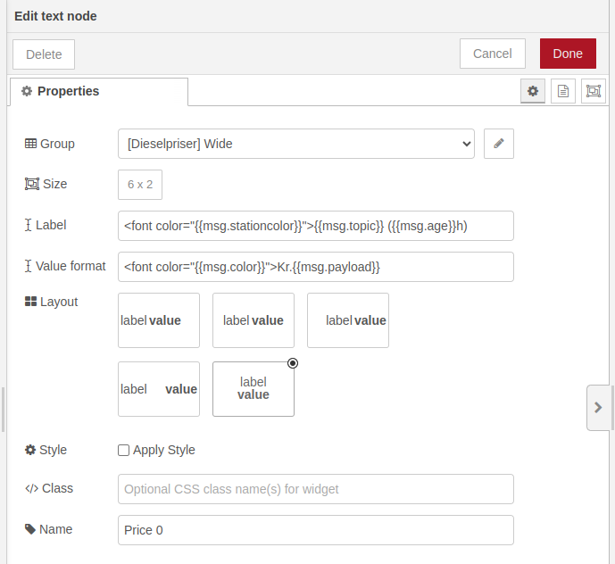

Dashboard 2 does not (currently) support label formatting. There is an open issue already.
PS: FWIW, font is depreciated (and will one day stop working!)
You can apply CSS styles throughout your dashboard using a template node.
Alternatively, you can use template nodes and v-cards to achieve this or any format you desire.