You can specify a single (page or site scoped) named class style in a separate ui-template then set the class name on your sliders.
If you Inspect that "thumb" slider element in your browser's Developers tools you'll see that it is created by a div that has a css style applied to it background-color: rgb(var(--v-theme-primary));
that css var seems to be overwritten and used by the Dashboard's Page Theme Primary color.
If it doesnt affect other styles on your page .. set the Page Theme primary color to orange
or better as mentioned above use your own custom css for better control
Here's one more element. Animated start button. Moving on with CSS.

<template>
    <v-btn ref="botao" style="background-color: #4F4F4F; color: #000000; border: 1px solid #000000; font-size: 14px; border-radius: 18px;" stacked @click="start">
      Start
      <v-icon ref="icon" style="font-size: 40px;">{{ icone }}</v-icon>
    </v-btn>
</template>

<script>
  export default {
    data() {
      return {
        icone: 'mdi-power-off'
       };
    },
    methods: {
      start: function () {
        this.icone = 'mdi-power-on';
        this.$refs.icon.$el.style.color = '#BD9608';

        setTimeout(() => {
          this.icone = 'mdi-power-off';
          this.$refs.icon.$el.style.color = '#000000';
          this.send({ payload: 'ON' });
        }, 1000);
      },
    }
  };
</script>
Perfect placement.. I'll study this now
Oops.. I'll test
It has become increasingly essential to block the direct passage of messages from input to output. For the creation of effective elements this must be optional. I haven't yet analyzed whether there are calls for improvement in this regard in the ui-templat, but it would be very necessary. Thank you for your commitment in advance.

Why has it become increasingly essential??
There is no additional overhead to msg's passing through nodes, and they can be disregarded by nodes further down the flow.
Please give specific examples why you think this is of value.
Because just like the feature of multiple outputs for the template node, being able to not let a message pass through reduces the need for more nodes to ignore messages. There are other things like saving the status of elements within the template when the page is reloaded. These are features that were already widely requested in 1.0 and implemented, but removing them from this new version would be like going backwards. I think this is a viable request and indeed necessary for anyone who works with the node. My humble opinion remains.
You don't have to "not let", or do anything to "ignore messages", you just don't make use of them.
IMO, it just introduced further complexity for no good reason, and goes against the general ethos of how flows should run in node-RED.
There are/were good reasons for both options, you can't just ignore them if you need them to set the state of the button at start, and yet you may not want to produce an output unless someone actually clicks the button, to prevent a feedback loop. And sometimes you do want the just want to know everything, or passthrough other properties of the msg.
All the other ui nodes (I believe) have an option for whether or not to pass through input messages. Personally I virtually always have that disabled as it is rarely useful to have the input message appear on the output. For example it is easy to generate MQTT loops if input messages are passed to the output.
indeed - and yet as most non-ui nodes are expected to pass though the msg, we get folk raising issues when ui ones don't ![]()
Haha, fair point
Are you sure? But anyway, I meant that it should be an option. Preferably defaulting to Off as many more problems are caused by ui nodes passing on messages than the reverse.
Personally, I have no use for a message that passes directly to the node. This should be an option because for use as MQTT this causes many problems. I think it's fair to have this as an option.
This will certainly happen when the creation intention is monitoring, showing that something is happening, as the developer needs the output to continue the subsequent flow. For those who develop drives, this is a big problem because you lose control over what will be activated on the other side. Helping one type and harming another just by removing a resource doesn't make sense.
When I have a dashboard page open then in the browser I see the page name as the title for the browser tab. Can I configure this in any way? I don't want to change the page name in the menu, just the browser tab. The purpose is so that I can identify the server as well as which page it is on.
[Edit] Further to this, in settings.js I can setup an editor page title. If I set that to "My Title" then in the browser tab for the editor I see "My Title: tab_name" which is what I would like to be able to do in the dashboard.
Is it me or is the whole "theme" thing not working correctly yet ? Whatever I change in the theme, nothing changes. Deleting a theme, making a new one, it works for the initial setup, after that, no changes.
My theme also doesn't work correctly. Manual changes to specific things are also not working. Some vue.js assignments are not being changed... I'm even leaving that aside and just taking care of the scripts.
Couple of questions:
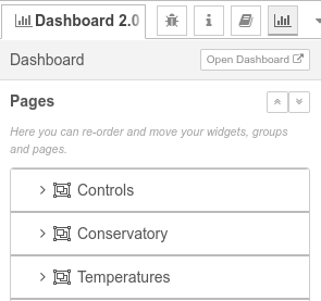
- How do I get the Dashboard page dropdown menu to be in the same order as the items in the editor Dashboard organiser?
- How do I get the widgets in a group to be the same height when they create a new row? (for example the dropdown widget forces all buttons on the same row to be taller than buttons on another row)
Apologies if these questions have already been dealt with, and would you point me in the direction of answer.
For me they are. That is assuming that by Dashboard organiser you mean

Then in the dropdown menu I see

