Lower spaces to compress output

Searching for a possibilty to compress my output, I found this thread with an example to reduce space between text lines.

But it's not really satisfying, because the space to the next widget will be than greater. So the size over all is the same :frowning:

My intention is to compress the output so I don't need to scroll down. Here you can see, what I mean:

Is there a solution to lower the space between widgets to normal gabs? (I played with the height in Alarms_Group_1_cards , but it changes nothing). Beside this, perhaps someone have a link to the description of that coding, where I can learn the meanings?

Also I'm wondering, why the borders and colors implemented there are ignored on my GUI?

How did you configured the size for gauge? It can be non square like 4x3 so it takes less vertical size. Also you may have spacers in that group.
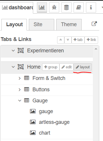
Examine with the layout tool...
image

I didn't change anything. But in this case it is 7x5, so it should use less vertikal size.


But the "problem" is the neeless space between the widgets (text-gauge, gauge-button).

If I make guage smaller, like:
grafik

I get:
grafik
There is also a big gap between the elements

But those text nodes time remaining and nex group. You must have some kind of css overrided .

Yes, from the example I linked:

[{"id":"cd068ce9.16809","type":"ui_template","z":"5aa31bbe.e3be94","group":"f03bcc4.355aa3","name":"","order":1,"width":0,"height":0,"format":"// note: the borders are just for visually \n// seeing what each element covers\n\n\n<style>\n#Alarms_Group_1  {\n    xborder: solid 1px black;\n}\n#Alarms_Group_1_cards  {\n    xborder: solid 3px red ;\n    height: 4px !important;\n}\n#Alarms_Group_1_cards .nr-dashboard-text {\n    xbackground-color: red;\n    xborder: solid 5px green;\n    height:20px !important;\n    position: static;\n}\n</style>\n\n","storeOutMessages":true,"fwdInMessages":true,"resendOnRefresh":false,"templateScope":"global","x":200,"y":80,"wires":[[]]},{"id":"f03bcc4.355aa3","type":"ui_group","name":"Group 1","tab":"abe23ae3.9bbb68","order":1,"disp":true,"width":"7","collapse":false},{"id":"abe23ae3.9bbb68","type":"ui_tab","name":"Alarms","icon":"dashboard","order":4}]

If I can understand, you are trying to render all the different text nodes in one place? Is this your intention?

My intention is to lower the gaps. This mean the gap between text lines and the gap between the widgets/groups. I want e less vertical size, so I don't need to scrol down to see all values. I prefer to see all values at one. And the gap between text lines were very large.

I thougt I can reduce it with the code in the link (I post #6). But as a result the gap between the lines are ok now. but the gaps between widges are greater than bevor. So the vertical size doesn't shrink.

If you have another solution, it's welcome. I have no idea how to do.

Yes, but you cant fight with the layout that way. All the nodes you are defined take the space you define in nodes configuration page. Those empty spaces are actual places where those text should be rendered and even you are overriding the CSS and texts are moved away, the occupied area stays.

The underlying card layout system works this and only this way.

If you need your texts (label : value) to be one after other, you'l need to implement such thing using the ui_template node.

Sorry, for asking again for understanding. My english is not so well.

This I have done with the template I postet in #6 - I think, and this works.And text looks better because of more comprehensive.

But if I understand

All the nodes you are defined take the space you define in nodes configuration page.

than the "saved" space will be used and empty, because a card (e.g. a text output) has a fixec heigth - right?

The values at the site settings e.g. widget size will fix this size? Normally to 48x48 - right?

If it is so, than I understand, that I can't fill my requirements and I have to take the output as it is.

Almost correct. The 48x48 is default size in pixels for one unit. You define how many units the widget can take. And yes, the size is fixed.
You can't remove or resize defined widget area even by overriding the CSS. (you can but whole layout will be ruined)

Ok, many thank for this learning session :slight_smile:

By that I meant something like this:

[{"id":"210989d0.5b6166","type":"ui_template","z":"78abef.11f5941","group":"a0e1236e.42475","name":"","order":4,"width":"6","height":"2","format":"<div ng-repeat=\"item in msg.payload\">\n  <span class=\"info label\" >{{item.label}}</span><span class=\"info value\" >{{item.value}}</span>\n</div>\n\n<style>\n.info{\n    font-size:14px;\n}\n.label{\n    padding-right: 5px;\n}\n.value{\n    font-weight:bold;\n    color:green;\n}\n</style>\n","storeOutMessages":true,"fwdInMessages":true,"resendOnRefresh":true,"templateScope":"local","x":480,"y":1060,"wires":[[]]},{"id":"434805c9.7fc83c","type":"inject","z":"78abef.11f5941","name":"","props":[{"p":"payload"},{"p":"topic","vt":"str"}],"repeat":"","crontab":"","once":true,"onceDelay":0.1,"topic":"","payload":"[{\"label\":\"first:\",\"value\":100},{\"label\":\"second:\",\"value\":200},{\"label\":\"third:\",\"value\":150}]","payloadType":"json","x":350,"y":1060,"wires":[["210989d0.5b6166"]]},{"id":"a0e1236e.42475","type":"ui_group","name":"Buttons","tab":"1854ea3c.181436","order":2,"disp":true,"width":"6","collapse":false},{"id":"1854ea3c.181436","type":"ui_tab","name":"Home","icon":"dashboard","disabled":false,"hidden":false}]

Ok, thanks, thats more granular :slight_smile:

This topic was automatically closed 14 days after the last reply. New replies are no longer allowed.