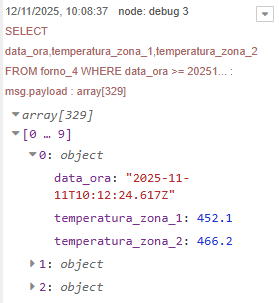
Hello everyone, I'm looking for your help as I'm new to this. I'm migrating a working project from Dashboard v1 to v2 and am having issues with the display format on line graphs. I need to display multiple temperatures on the graph, referring to the same timeline. The values are read from a SQL server. The array string I get from the server is as follows:
In this case, the temperatures in the array provided by SQL are 2, but in other cases, I get up to 8 temperatures to display. Can you give me some advice on how to format the array for display? For now, I can display one temperature at a time.
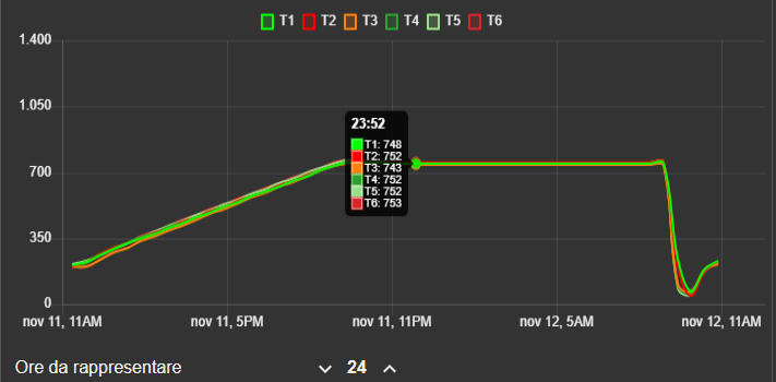
With dashboard v1 the graphs looked like this:
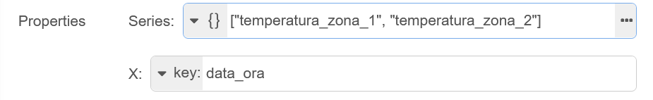
I have not done this, but I think the key sentence in the documentation is:
If you want a single piece of data to plot multiple lines, you can set the Series property to JSON , and then provide an array of keys (e.g. ["key1", "key2"] ), which will plot a data point for each key provided, from a single data point.
If you can't get that to work then please provide some sample data so that I can try myself. Use a query that only gives a few points and then see the canned text I will paste below to show you how to copy the array from from the debug pane and paste it here.
In the chart node make sure that the X Axis Limit time that you enter is large enough that your data will lie within that time (measured from the current time).
There’s a great page in the docs (Working with messages : Node-RED) that will explain how to use the debug panel to find the right path/value for any data item.
Pay particular attention to the part about the buttons that appear under your mouse pointer when you over hover a debug message property in the sidebar.
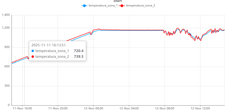
Thanks for the advice. The solution proposed by jbudd worked for me. I just want to be able to display a name for the various curves that is different from the array name provided by the SQL array. Is this possible? Should I just introduce a function block where I fetch the incoming array from the SQL and rewrite it on output with the modified variable names?
To answer (jbudd) this question, the data is taken from SQL using a fixed query. The only thing left to the user's discretion is to choose whether to display the last hour or the last 24 hours (for a more general view of the graph).