Comparison Charts (new section!!)
I will regularly post new country comparison charts as comment to this forum topic. Here below the list of charts I have posted so far.
- Italy (lock down date=2020-03-05) generated at 2020-03-19
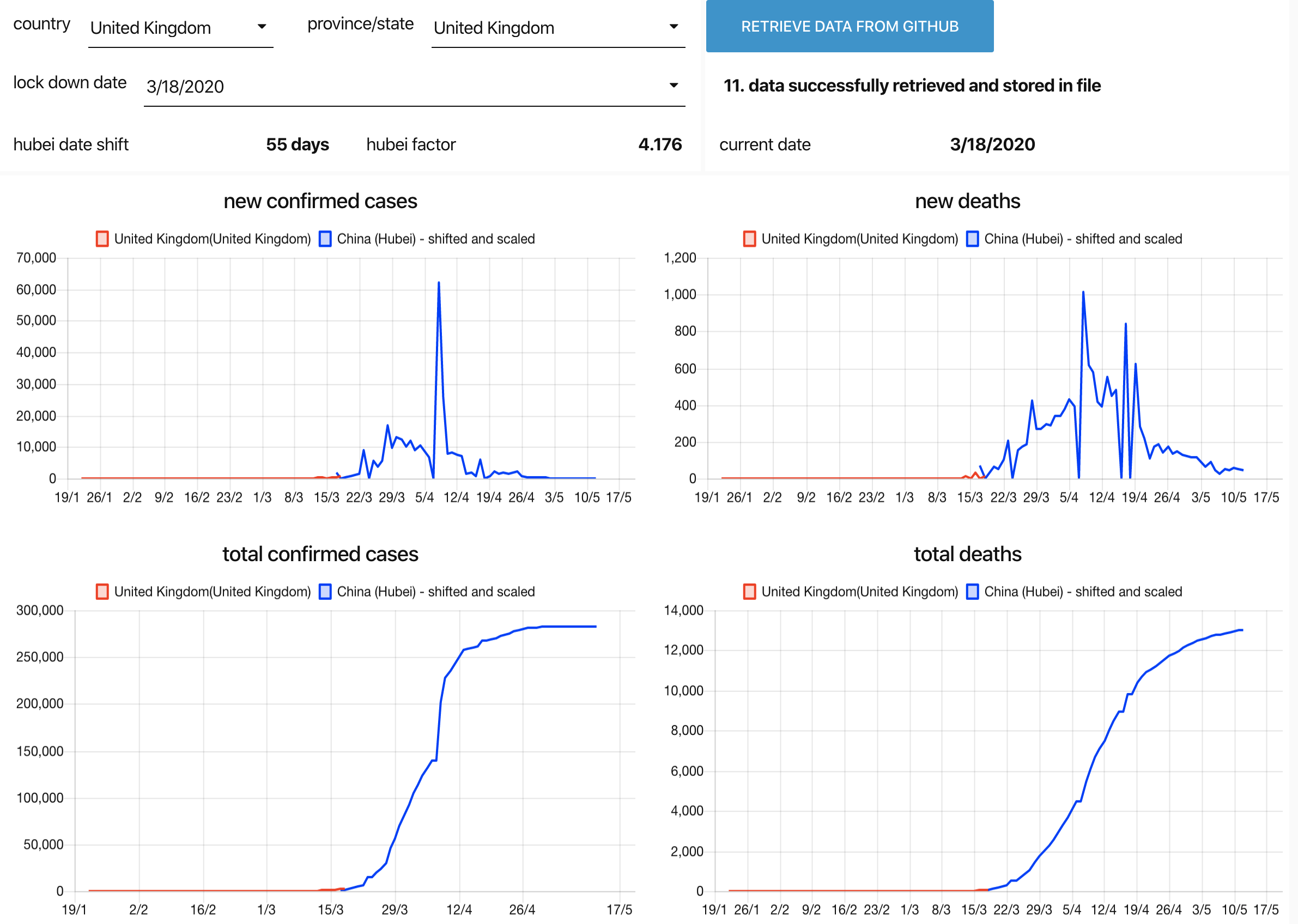
- United Kingdom (lock down date=2020-03-18 or 2020-03-15) generated at 2020-03-19
- Spain (lock down date = 2020-03-12) generated at 2020-03-20
- Belgium (lock down date = 2020-03-12) generated at 2020-03-20
- Belgium (lock down date = 2020-03-12) generated at 2020-03-22
- Netherlands (lock down date = 2020-03-15) generated at 2020-03-22
- Italy (lock down date=2020-03-05) regenerated at 2020-03-22
- France (lock down date = 2020-03-12) generated at 2020-03-22.
- Belgium (lock down date = 2020-03-12) generated at 2020-03-25 (but also including stats for that day).
- United Kingdom (lock down date=2020-20-23) generated at 2020-03-25
- Italy (lock down date=2020-03-05) regenerated at 2020-03-28
- Spain (lock down date = 2020-03-15) generated at 2020-03-28
- Netherlands (lock down date = 2020-03-16) generated at 2020-03-28
- Belgium (lock down date = 2020-03-12) generated at 2020-03-28 (but also including stats for that day).
Flow
The flow is too big to embed in this topic.
You can download it from here:
This flow uses the node-red-dashboard nodes (I have tested it with version 2.19.4)
Github Project link
Description
This node-red flow is creating a dashboard showing the historical statistics of the corona deaths and corona confirmed cases for the selected country or province/state.
The statistics are retrieved from https://github.com/CSSEGISandData/COVID-19
It also puts in the same charts the statistics for the province Hubei (China) were the outbreak began. To make comparison easy I have scaled and shifted the chart for Hubei.
The time shift ( "hubei date shift" ) is determined by the "lock down date" that you can specify. So the Hubei charts will be shifted so that the lock down date of Hubei (= 23rd of January 2020) falls together with the "lock down date" you have specified.
The "hubei factor" is the factor used to scale the Hubei deaths and Hubei confirmed cases in the charts. The "hubei factor" is calculated as the ratio of the current total number of deaths for the selected country or province over the total number of deaths in Hubei at corresponding date relative to the start of lock down.
Usage
At startup this flow will read the statistics from a local file covid.json . The very first time this local file will not exist and an error message is reported in the dashboard (this is normal). So in that case you must retrieve the data from Github by clicking on the button retrieve data from github . Note that this takes several minutes. You will even loose your browser connection. This is expected. Just be patient and you will be automatically reconnected. If everything is fine then this data is also stored in the local file.
FYI it is not the retrieving that takes a lot of time but converting the data to proper json structure that is time consuming.
Once the data is retrieved, you can select the country , province/state and lock down date and the charts will automatically be updated.
You can always refresh the data with the latest available data from github by clicking on the button (but as said this takes several minutes).